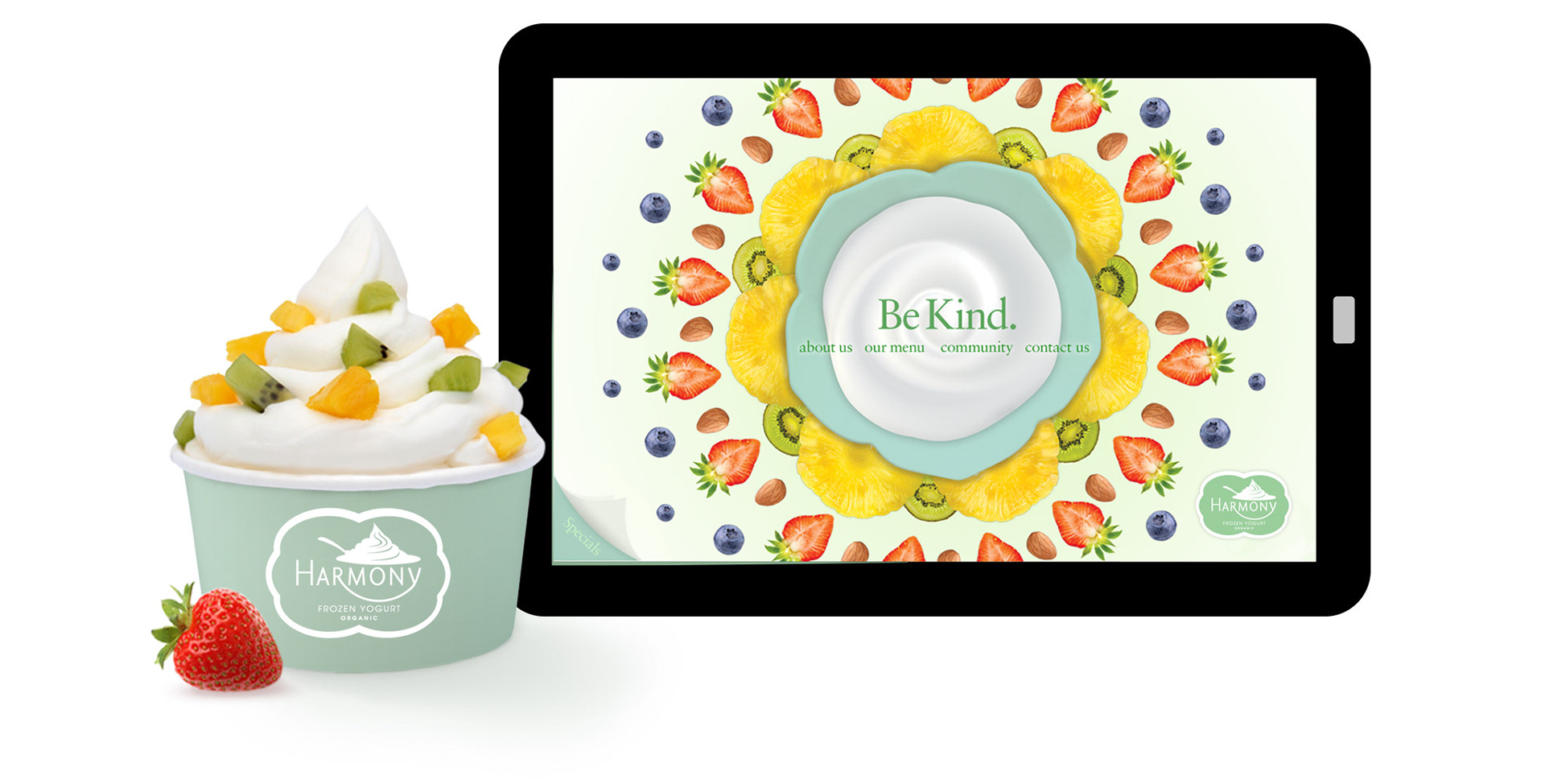
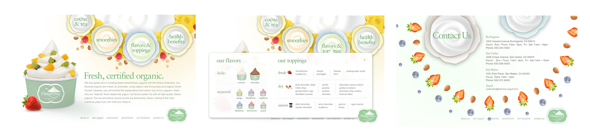
Brand Visuals, Web site Redesign
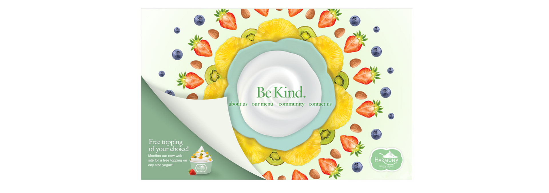
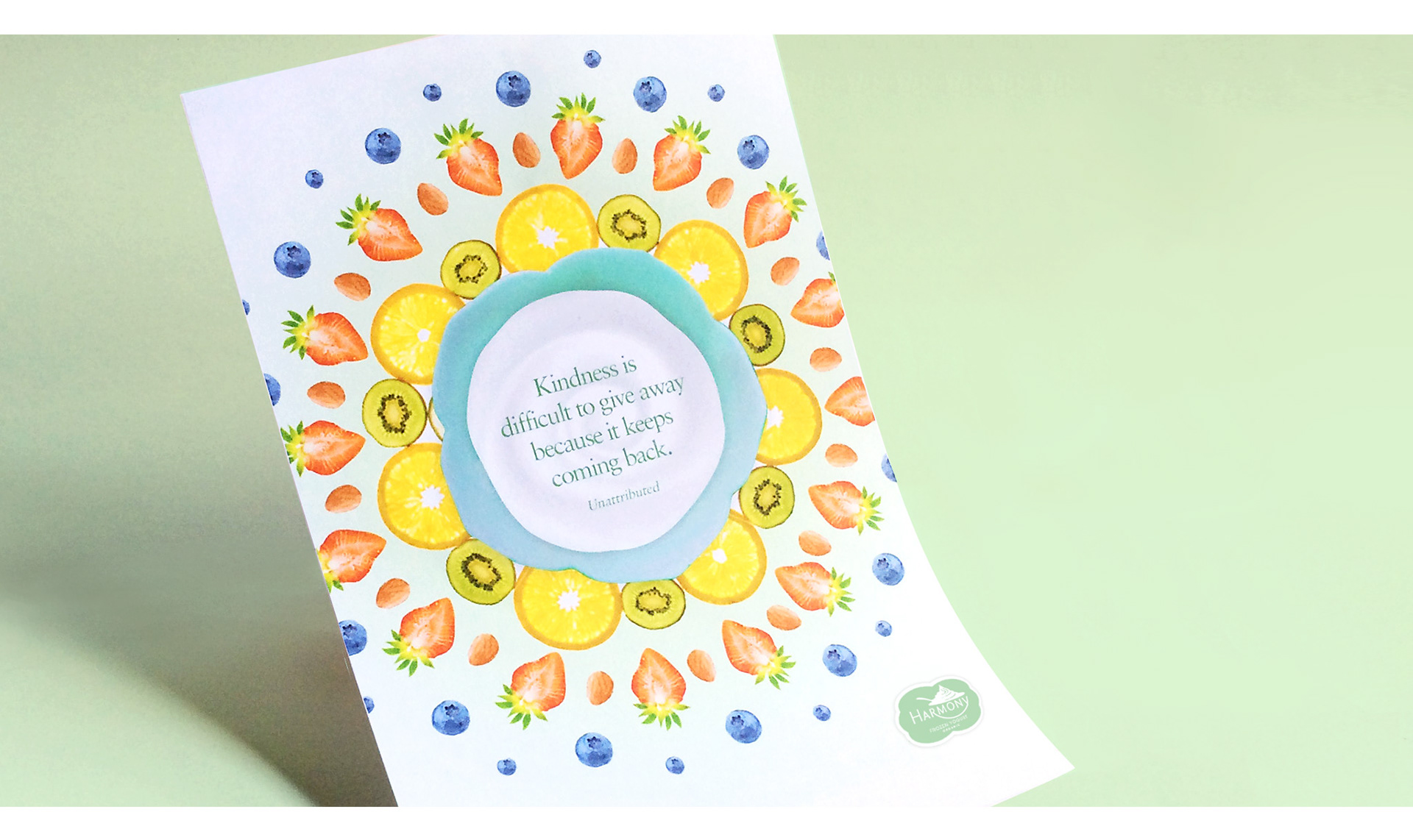
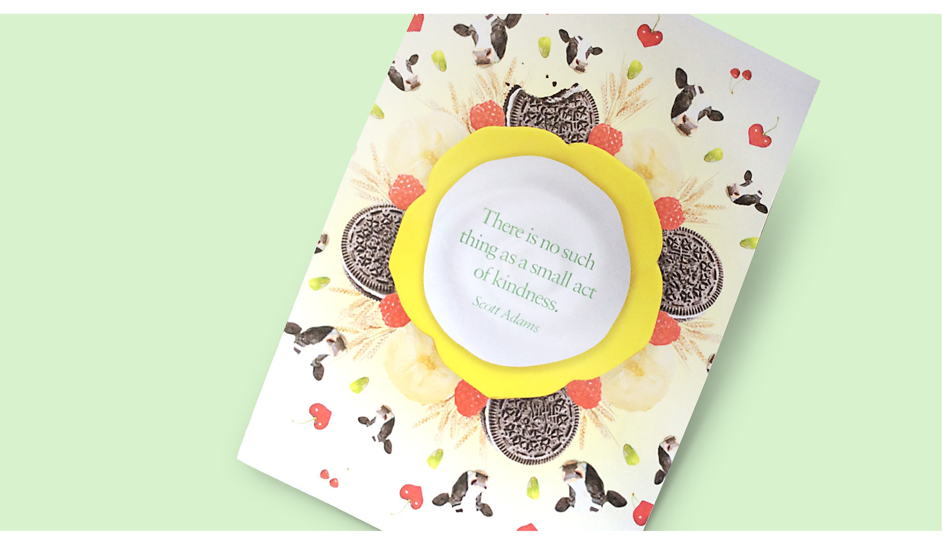
"Be Kind" Promotional Campaign
Challenge / Create a brand identity for a yogurt company to compete within a saturated market.
Strategy / Out of several conversations in the discovery phase we found rooted in the company’s philosophy was its belief that from acts of kindness great things emerge. We leveraged this to communicate the company’s natural and organic yogurt in a memorable way.
The “Be Kind” theme was integrated into the web site and communicated in flyers and in-store poster displays. The visual direction focused on the natural qualities of the product through photography of fresh fruit and delightful colors evoking desire. Charming animation was used to create an engaging and interactive experience.
Results / Harmony Yogurt has become a favored local destination and is gaining market share among competitor brands.